
Context: Information Design & Data Visualisation Module, College Project (Year 2)
My Role: User Research, Information Architecture, Visual Design, Accessibility
Tools: Illustrator, Mural
Duration: 6 weeks
This project explores coffee shop consumption and waste over a weekend, using data visualisation to highlight customer habits, resource use, and environmental impact. Based on my experience as a barista, I wanted to tell the story of waste often overlooked during busy hours.
Problem Statement
Coffee shops are a big part of our daily routines, but they also produce a lot of waste, and many customers and business owners don’t realise how much it adds up. How might we visually represent a weekend’s worth of coffee shop waste in a simple, clear way that raises awareness and encourages more sustainable, informed choices?
Background
Data Collection
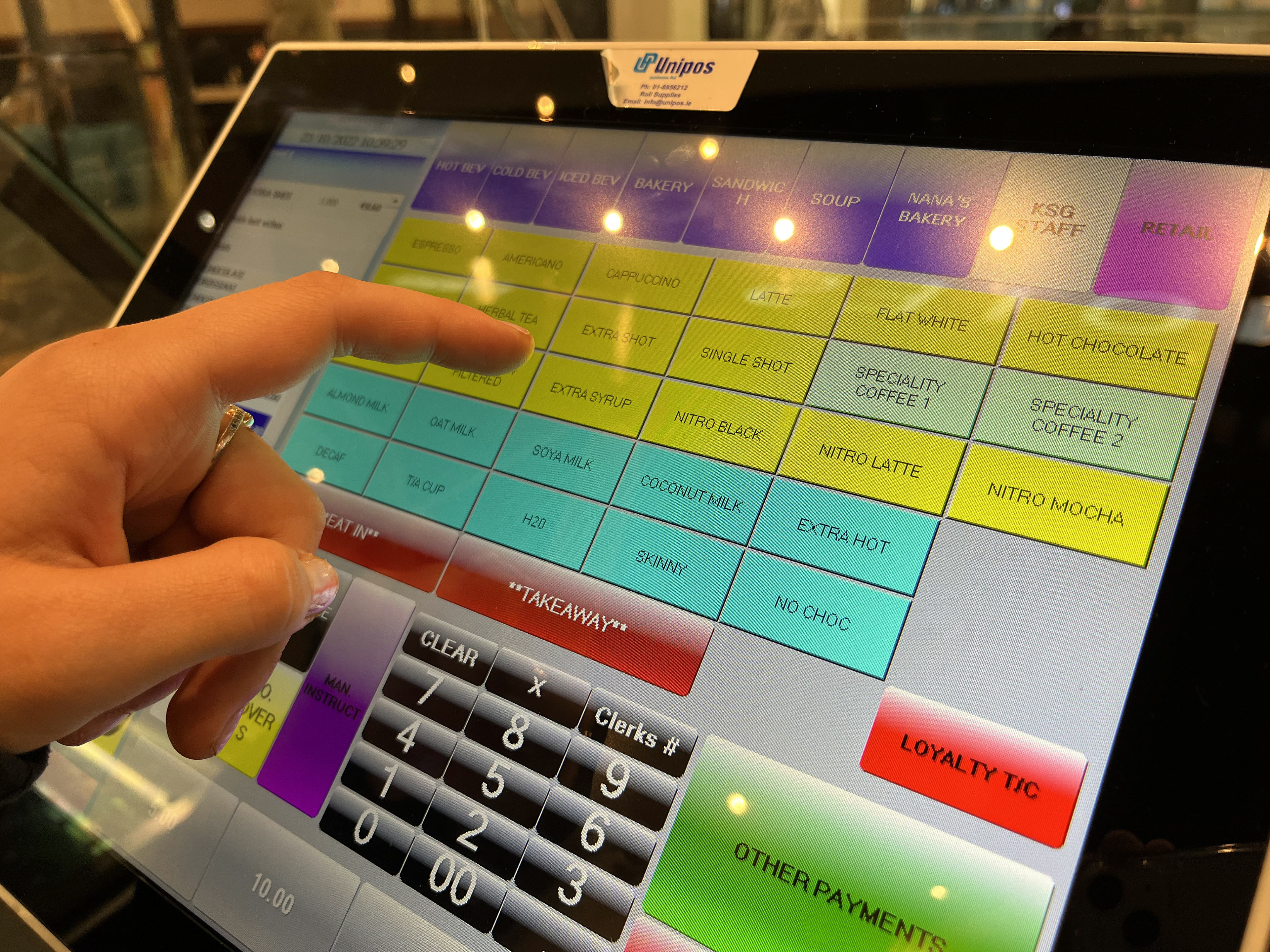
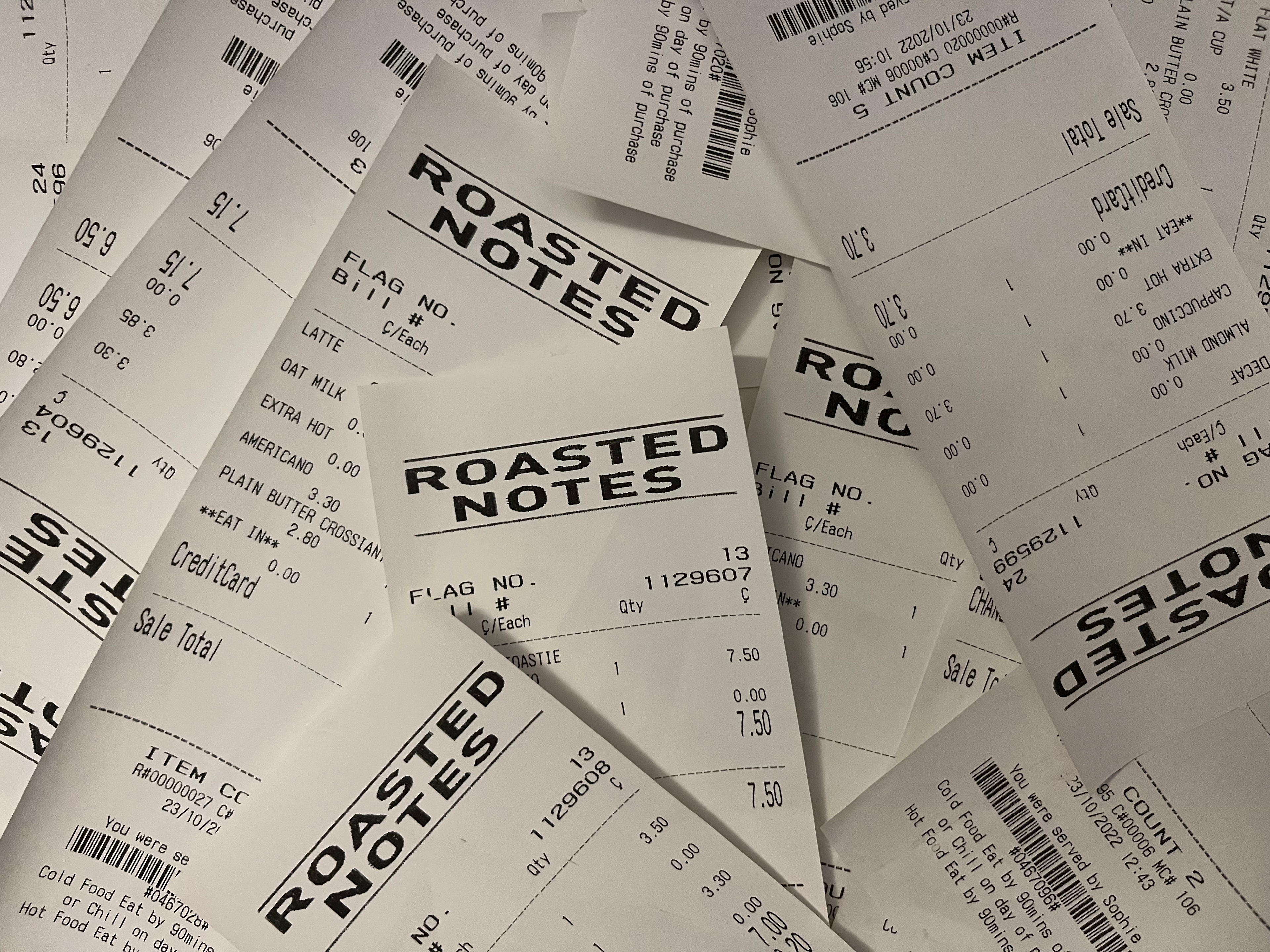
Key Insight
The problem isn't the lack of reusable cups because most customers prefer to sit in. The main problem is the carbon footprint of milk, water, and coffee beans. 73% of a single cup's carbon footprint is dairy milk.
Target Audience

Coffee Shop Owners

Customers

Sustainability Advocates
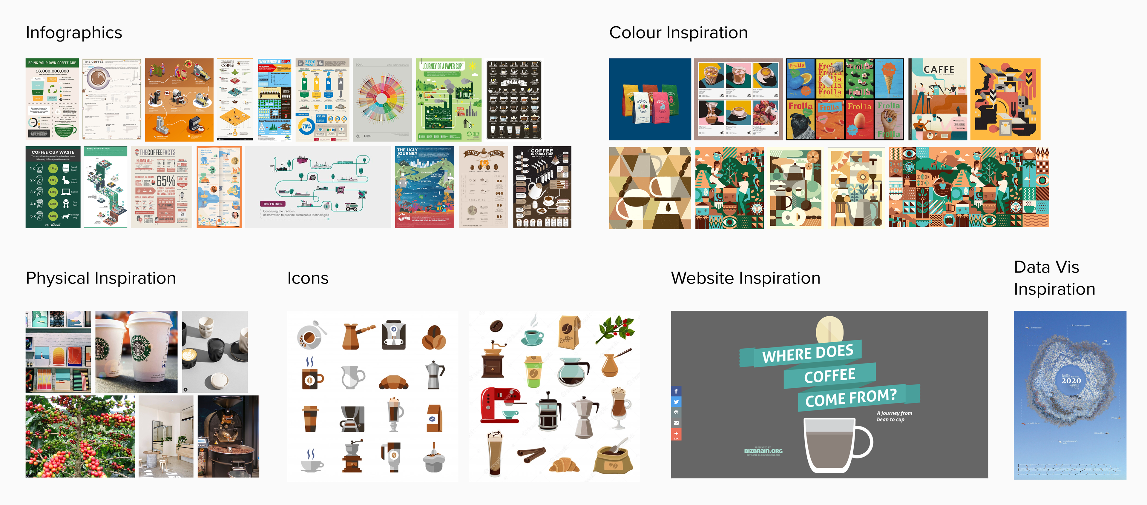
Ideation & Design Process
Sketches and Low-Fidelity Prototype

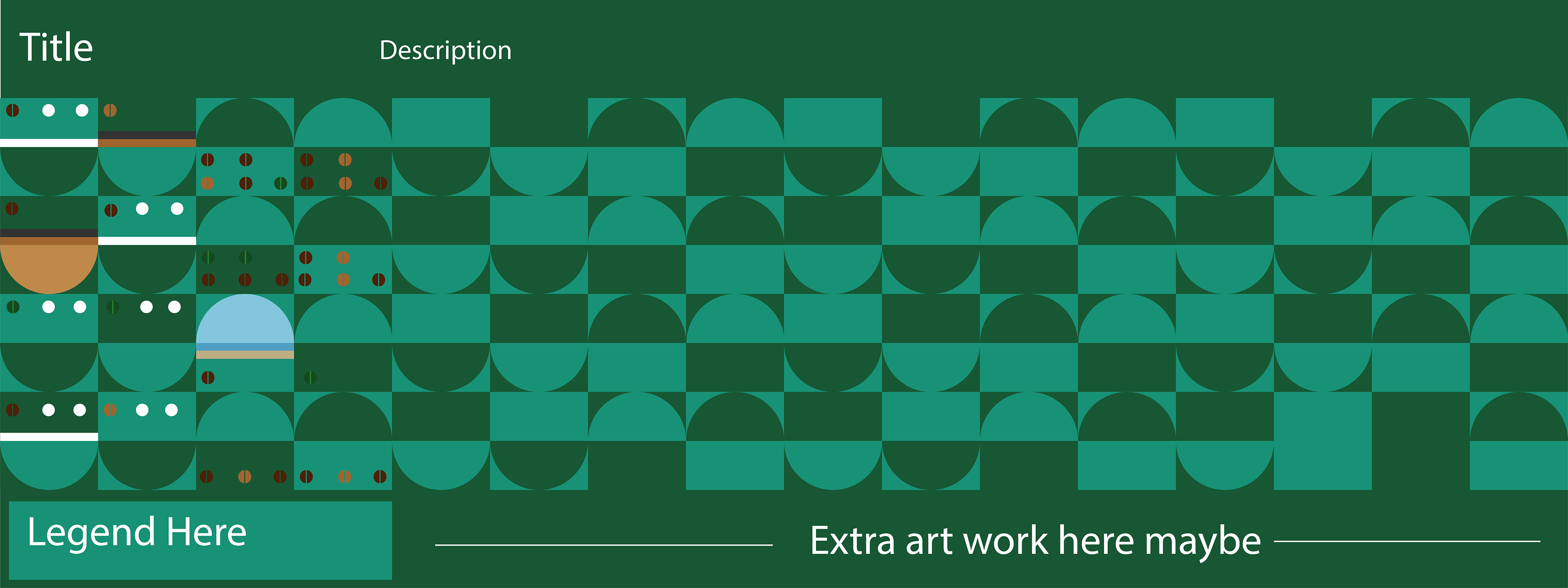
The first sketch inspired by Giorgia Lupi's style
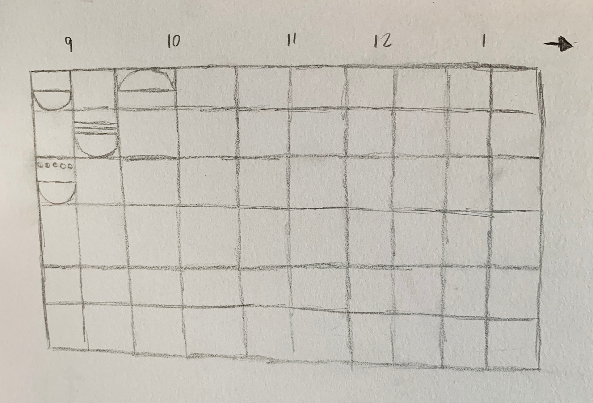
Visual style developed into a more simplistic design

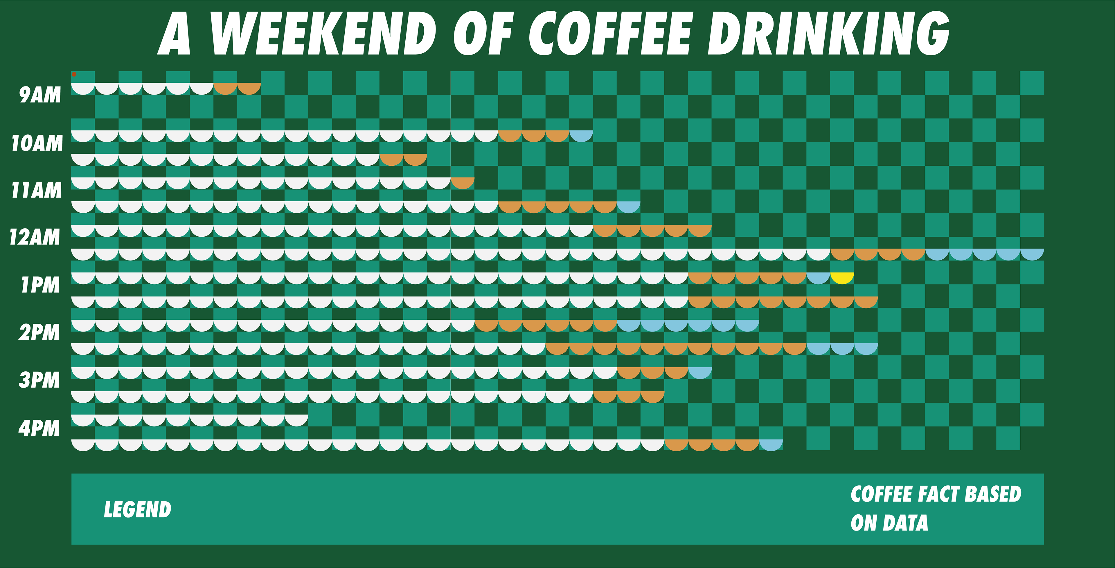
High-Fidelity Iterations
Challenges
I overcomplicated my prototype by imitating Giorgia Lupi’s style without fully understanding it. Overwhelmed by data, I struggled with the visual direction. The feedback helped me simplify, leading to a mural-style design that better suited the project goals. I learned clarity is more effective than complexity.
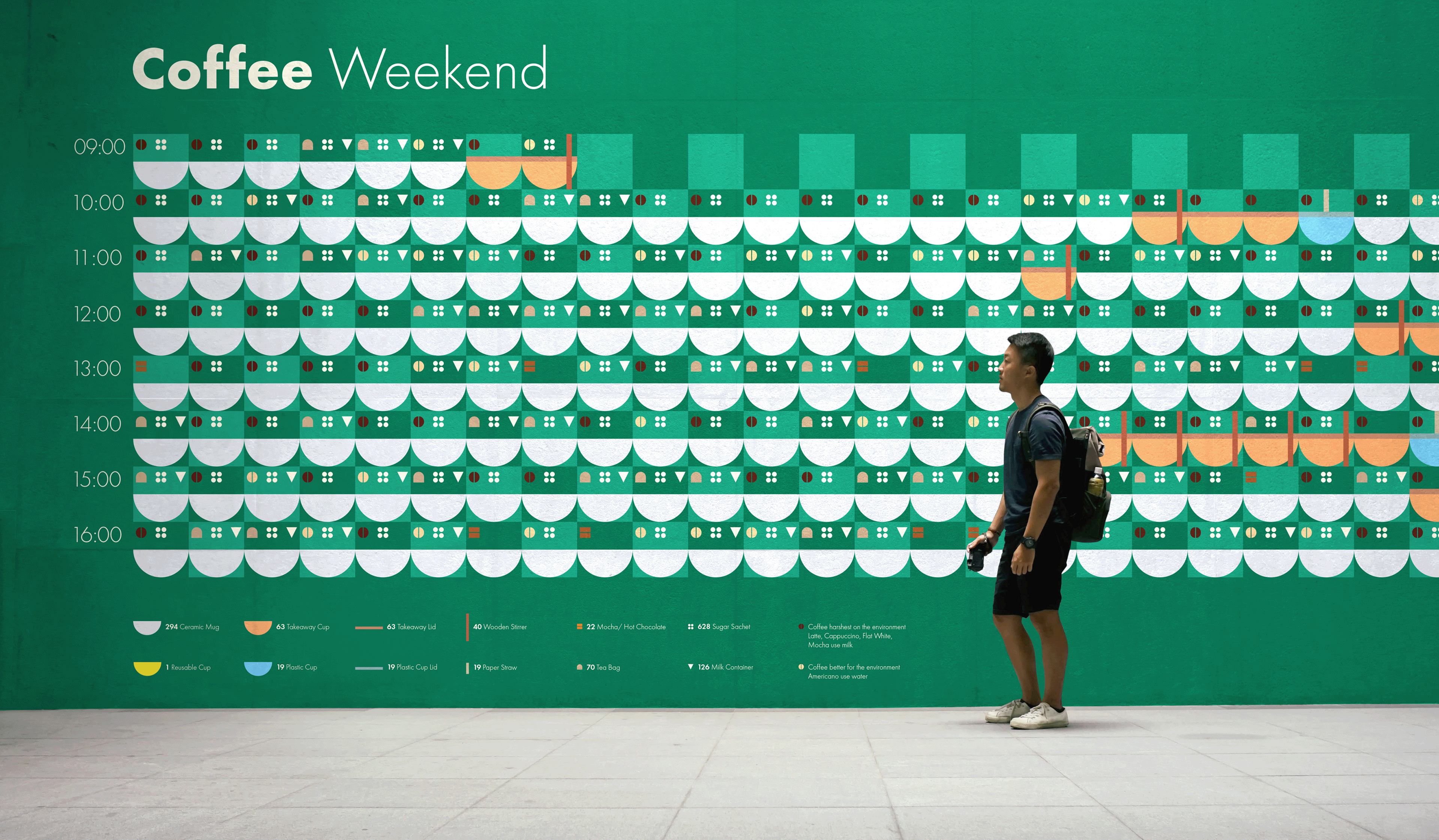
Final Design
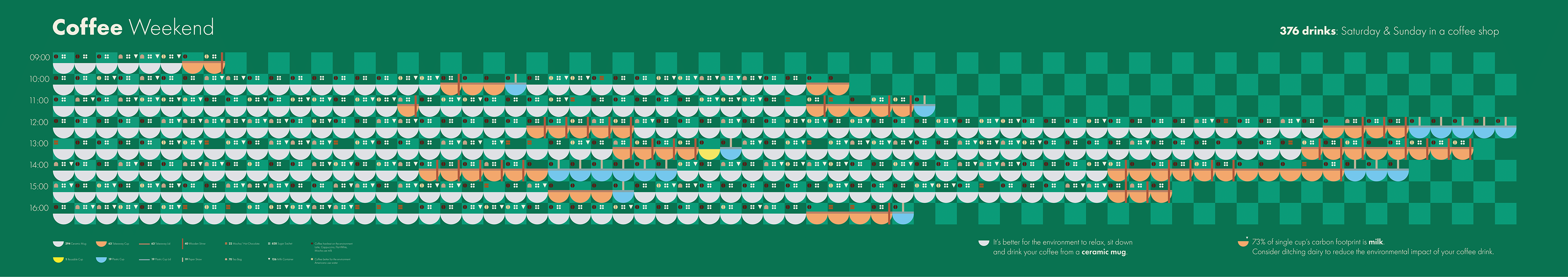
Full Mural
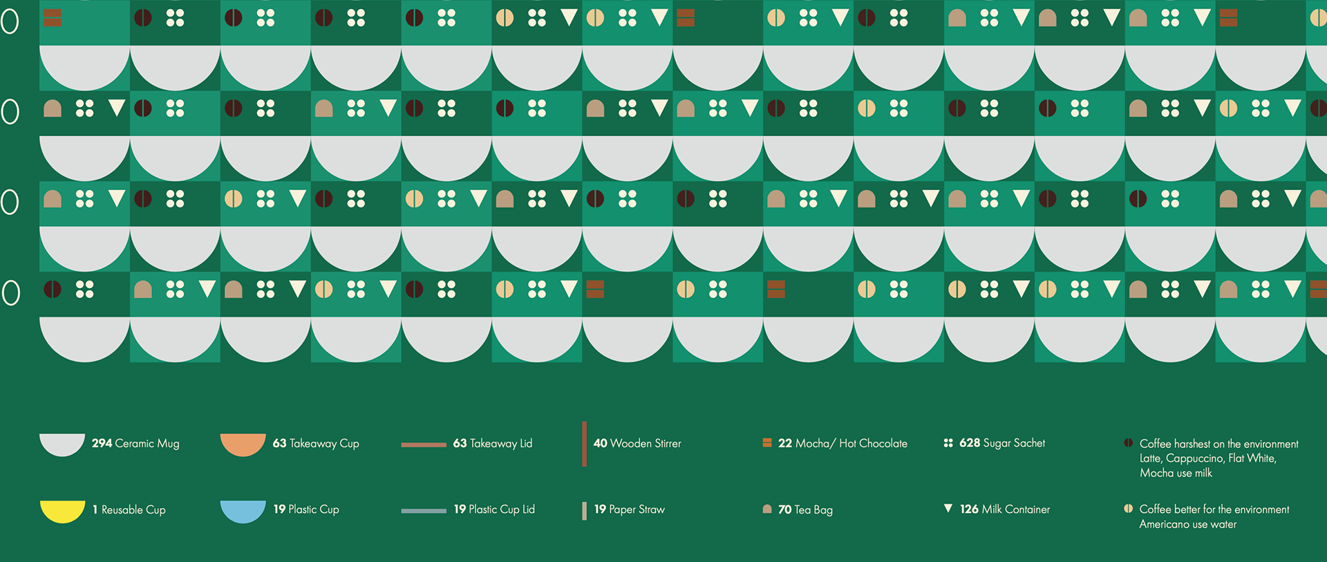
Ceramic mugs are grey to emulate the colour of mugs and for contrast against the green background. Takeaway cups are brown to represent cardboard, reusable cups are yellow for visibility, and plastic cups are blue to suggest transparency. Coffee with a higher environmental impact has a dark bean icon, while more sustainable options have a light bean icon.
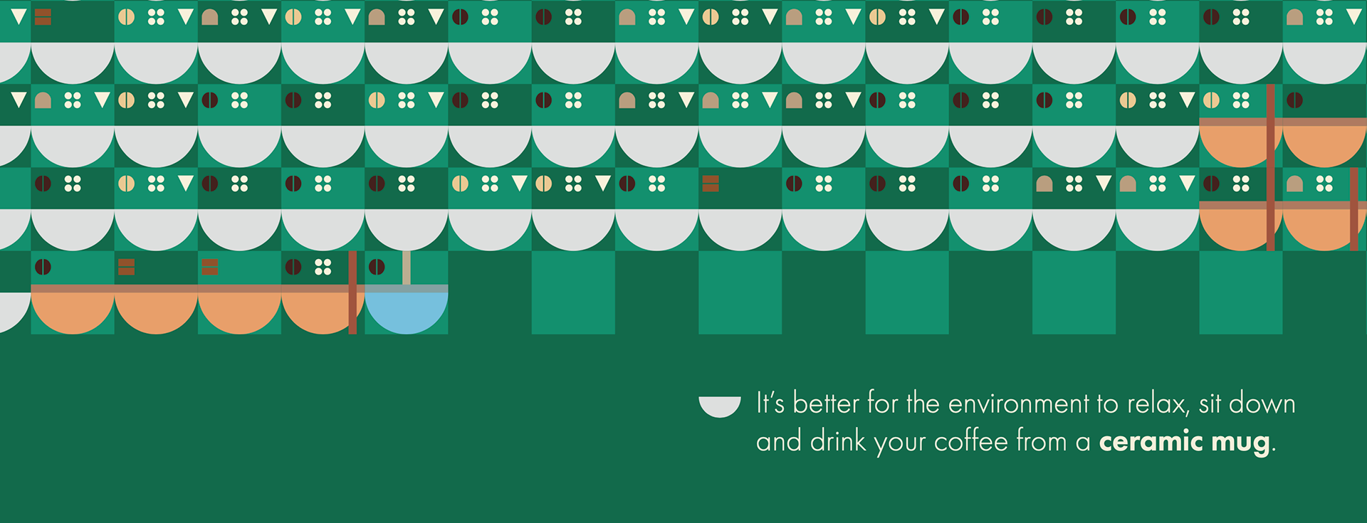
The mocha/hot chocolate icon consists of two rectangles, resembling a chocolate bar. The sugar sachet icon depicts four sugar granules. The tea bag icon mimics its real shape. The milk container icon is a triangle, inspired by the side profile of milk cartons.
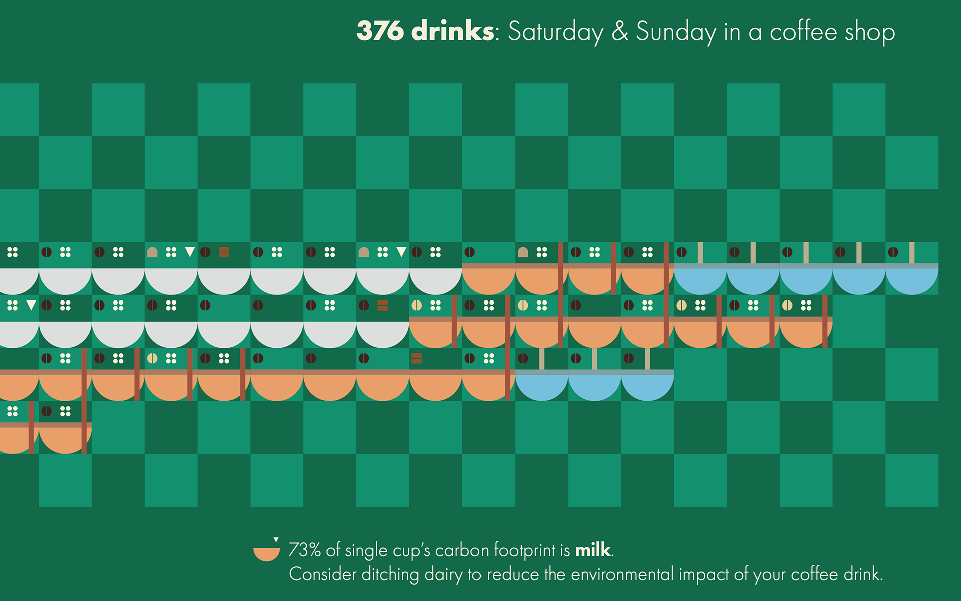
Takeaway and plastic cup lids are horizontal rectangles placed on top of the cups, slightly darker for visibility. Wooden stirrers are vertical rectangles in a darker shade for contrast. The paper straw is beige, resembling real paper straws.
Mural Mock-up
Key Learnings
Strengths
The data story was relatable and engaging, transforming a mundane topic into an interesting visual narrative. The mural format effectively showcased the scale of waste, making the data more impactful. Strong visual research and early design testing allowed for continuous refinement, resulting in a clear improvement from the first to final prototypes.
Areas for Improvement
Document more of my design process to explain my changes. Continue developing my visual design skills through active research, and analysing contemporary examples. Practice regularly by creating mock-ups and critically evaluating each iteration to improve my design and typographic abilities.
Next Steps
If expanded, the project could become a sustainable campaign promoting reusable coffee cups and reducing coffee dependency. Visually appealing murals could spotlight major coffee chains for public traction. I’d also gather insights through interviews, surveys, or conversations with coffee shop owners, baristas, and customers about waste perceptions.