Project Goal
To tell a visual story of the consumption and waste generated in a coffee shop over a weekend through data visualisation.
Data Collection
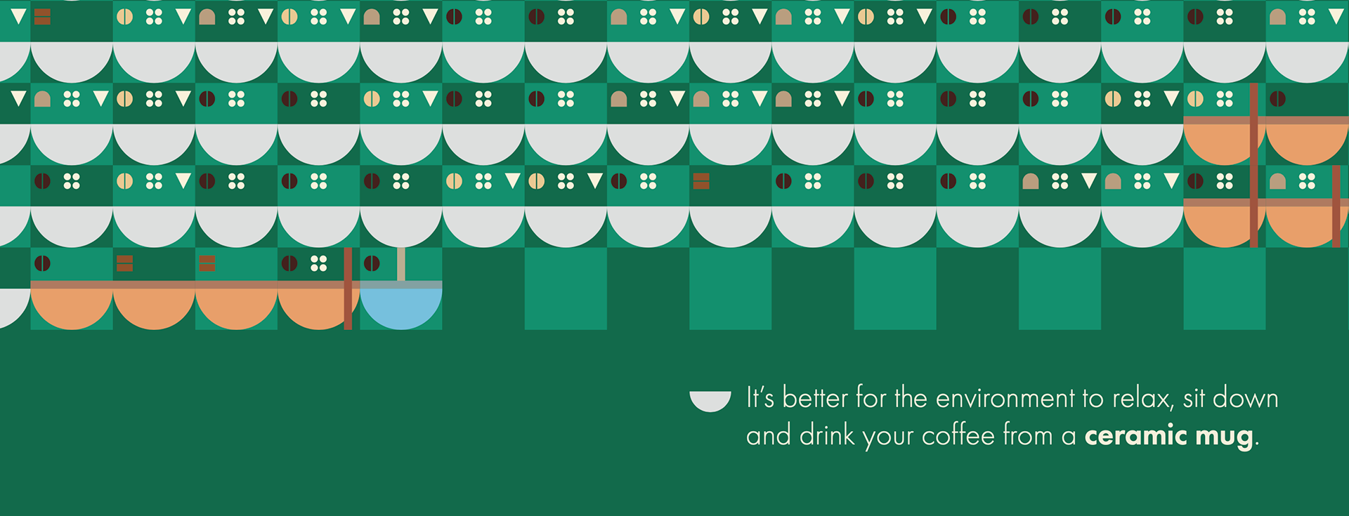
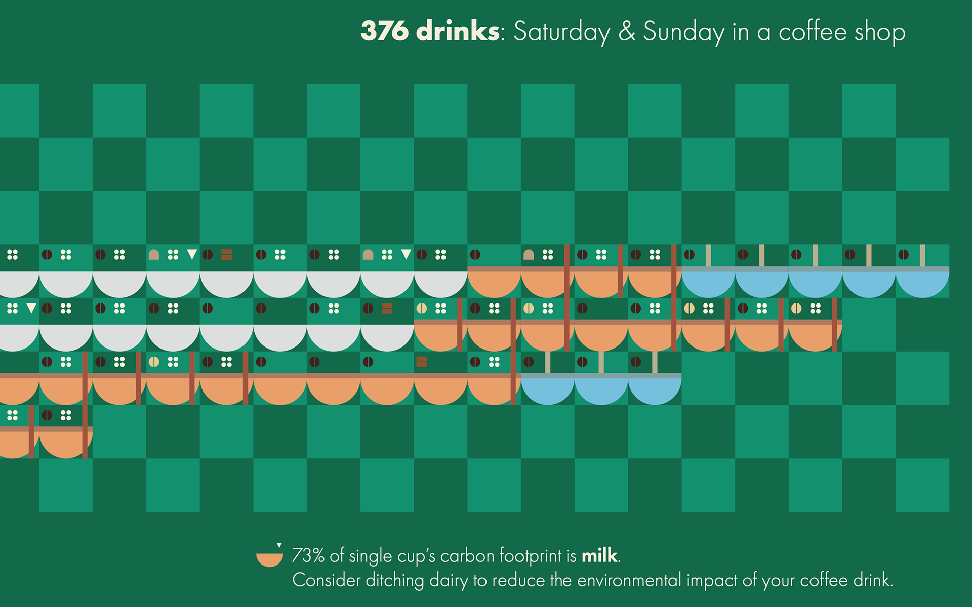
The problem isn't the lack of reusable cups because most customers preferred to sit-in. The main problem is the carbon footprint from the milk, water and coffee beans. 73% of a single cup's carbon footprint is dairy milk.


To begin visualising the data, I sketched out ideas that would help develop my final design.

Final Design
I was inspired by art murals and geometric shapes which gave me the opportunity to show each and every data mark and it resulted in a truthful story through data visualisation.
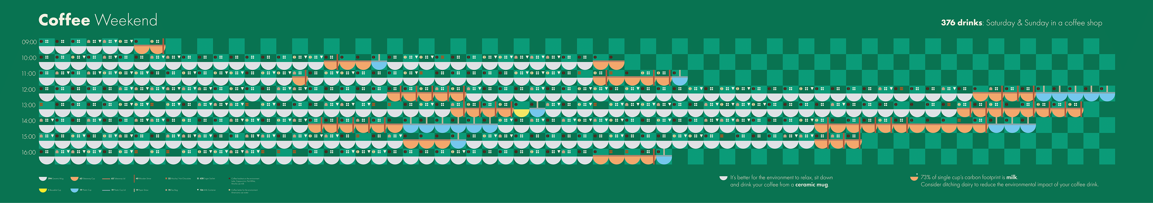
Close-ups
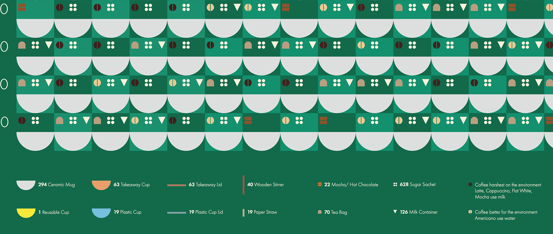
Ceramic Mugs are grey to contrast with the green background and it's a typical ceramic mug colour. Takeaway Cups are brown to signify cardboard. Reusable Cup are yellow to stand out from the rest. Plastic Cups are blue to add colour variation and contrast.
Coffee that's harsher on the environment have a dark coffee bean icon. Coffee drinks better for the environment have a light coffee bean icon.
The Mocha/ Hot Chocolate icon is two chocolate bars. The Sugar Sachet icon is four granules of sugar. The Tea Bag icon is shaped like a tea bag. The Milk Container icon is an upside down triangle which is inspired by the triangular shapes of milk cartons.
Takeaway Lids have a flat design lid that follows the same colour as Takeaway Cups - same with Plastic Cup Lids. Wooden stirrer is a darker brown that's upright to look like a coffee stirrer. Paper Straw is beige to look similar to a real paper straw.

Reflection
This was my first project for the course and I was pleased with my final design and the design research and process was an important learning experience.
I would find an easier method of synthesising the data because my method with the data tables was crude.